Notice: this is version 2 of this lesson. I've rewritten most of it and redone all screens and files from scratch after some corrections/advices from patd (on reply, below).
Complete GUI Scripting - 3: Preparing and importing assets
When designing interfaces, no matter which media is the target, it's common for designers to just work on Photoshop (or a similar program) to create the basic layout, then import (or recreate) it in the final production tool. Creating Flash content works like that, creating After Effects content works like that, and GUI scripting couldn't be different; usually, the first step to creating an interface for the DOOM 3 engine would be to create it on your graphics editing package of choice than exporting images to be used by your GUI script.
While creating the general design of an interface is something much bigger and that is beyond the scope of these tutorials, there's a lot that can be said about exporting materials correctly from Photoshop then using them on the DOOM 3 engine. This tutorial will start from a finished PSD file, then we'll export all materials thinking about how they should work, then reassemble them on the GUI editor.
For this lesson, there's a little background that I have to add, to explain the sample PSD we'll be working with. Please bare with me while I go a bit off topic now...
...before the alien/demon invasion, the UAC officials on the UAC base on Mars were very worried about the staff morale. After all, being slayed by HellKnights and turning into zombies can put anyone down. To help bringing staff morale up, the UAC officials created a weekly cake celebration - basically, the kitchen staff would create a cake using brand-new UAC technology and put it on the kitchen for everyone to eat and feel happy.
However, the situation on Mars kitchens aren't exactly top-notch, and after complaints about people feeling ill after eating the weekly cake, the UAC decided to put a panel next to the cake indicating the current cake quality. Everybody could get on the cake status panel and look at the current cake quality before trying to eat it. Also, if they think the status is wrong, they can simply click a button and change the current cake quality, so anyone approaching the cake status panel later will also notice the current cake quality.
On the next few lessons, we'll be building the cake status panel. Here's a preview of how it will look like after we're finished.

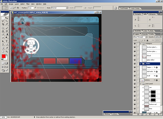
With that said, this is the *complete* cake status PSD, opened in Photoshop (again, all files are available for download on a link at the end of this tutorial, so download to try yourself). This is just a quick design I created for this lesson, but it illustrates well what GUIs usually need.

All layers are shown on this screenshot, and some content will be created on the GUI editor itself. Also, notice I created the PSD file using a 640x480 size - this will help when I have to resize and position windowDefs on the GUI editor, so I just need to see their original values and positions.
Before we start exporting everything to materials, one word of advice: while GUI scripts works a lot like Photoshop - windowDefs work like layers, being stacked and all that - creating one windowDef/material for each PSD layer is not a good idea. If you use shared assets (like materials that are common and used on other GUIs too), this is fine, but other than that, it's a good idea to stack as many layers as possible on one single material file. This is what I'll do here, so even though this is a semi-complex PSD file with folders and a couple dozen layers, it'll be a pretty simple GUI script in the end.
Okey, let's start. The first thing to do here is to turn everything you don't want off, while seeing what you want to export as one material. In our case, we will first export the background; so we hide everything (including the background) and let the panelBack layer (and its grouped layers) visible only.

Now, select all (CTRL+A), make sure you have a visible layer selected (worst Photoshop usability bug ever), and select the menu "Edit > Copy Merged" (SHIFT+CTRL+C) to create a flatten copy of everything on the clipboard.
Now, select the "File > New" menu (CTRL+N). You'll notice it uses the values of the visible clipboard width and height in the new image properties, so just click OK or press enter to create a new image.
With that image created, select "Edit > Paste" (CTRL+V), delete the default "background" layer on the layers panel, and you'll have a new material ready to be exported.

Before saving, however, there's are two catches.
The first catch is related to the image size. As you'll notice on the "Image > Canvas Size" menu, our image has a 600x440 size. We will transform this on an image to be used by the DOOM 3 engine; and 3D video cards only use images with dimensions that are a number which is a power of two - that means using dimensions like 64, 128, 256, 512 and so on, so we have to conform to those rules.
Even though we *could* create images with custom sizes - in fact, I did that, in the first version of the article, but the result was pretty bad - it would mean that the engine would resize the image to a given size (256x256, or something similar) before using it, then resize it again when displaying it.
With that said, we have three choices now. We can:
1. Grab our 600x440 image and resize it to a valid size on Photoshop, like 512x256, then export it at that size and simply use it with the original 600x440 size on the GUI script; or
2. Add some transparent areas to our image to make it big enough to fit into a valid image size, like 1024x512, then export it and use it at this same size on the GUI script; or
3. Build our image from several small images (corners, top, sides, center), each one a separate image with a valid size.
Memory wise, the first choice is the better one; we would use the whole area for our image. It would result in resizing, though, and in the end the image would never be crisp, even at the original 640x480 size.
The second choice is a good one because you would have the image be as crisp as possible, but you would be wasting texture space.
The third choice is overall the best one; however, it would be harder to implement since you'll have to develop a whole user interface system that makes sense. This is the good choice to make when building a complex window-like system, or several different GUI scripts that would share the same assets and have different sizes, but for our example which is a lone GUI script, it would be overkill.
With that said, I'll stick to the second option for now. Keep in mind, however, that in the future, you will have to decide which is the best option, and it will vary according to several different factors.
Okey. So we will add some little unused space to our image; call the "Image > Canvas Size" menu, and resize it to the next big sizes which are valid numbers. In this case, 1024x512. Also, be sure to click on the top left anchor button, so our image will stay at the top left corner of the document. Like so:

It will resize the canvas without touching the image.

Now, the second catch. Since this material will have a transparency, we have to make sure an alpha channel gets exported. Now, if we were exporting this image to a PNG file, we could simply export/save it now. But since this is a TGA file, there's something we need to do: create an alpha channel manually.
Press CTRL and click on the name of the layer on the layers panel. This will create a selection that matches the current layer's alpha mask, so you'll see the so-called walking ants on top of the layer's opacity edges.

Now, select the "Select > Save Selection" menu, and use whatever name you want as the new channel.

This creates a new alpha channel on your document file. You can find it in the "Channels" window in Photoshop; it's a just grayscale mask of your opacity, where whites means total opacity and black means total transparency.
We're finally ready to save, wew. I hope that wasn't hard.
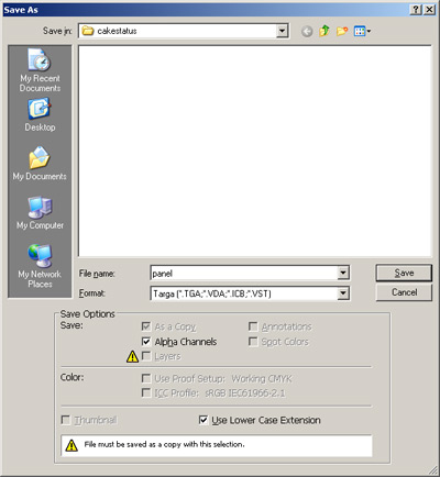
To do this, select the "File > Save As" menu (for other Photoshop versions, do "File > Save as a copy"). On the screen that opens, be sure to select "As a copy", select the "Targa" (TGA) format, and make sure that "Alpha Channels" is also selected.

Also, this time, instead of saving everything into DOOM 3's /base dir, we'll get a bit more organized. Create a new "cakestatus" directory on the <doom3>/base directory, and save this new tga file there, with the name "panel.tga".
When the bit options window pops up, be sure to select "32 bits" as the exporting option, or else the alpha channel won't be exported.
Great, this first material is exported and ready to use. Before we can jump into the GUI editor, however, we have other materials to export. So close this new file (and don't save it - you don't have to) and we're back to the original PSD file.
Hide all layers, and turn on the "_noisegore" folder and all layers inside of it so we can export the blood and broken glass overlay materials.

With that done, the process is pretty much the same as the previous one, and I'm using the "blood.tga" name. Once again...
1. Select everything (CTRL+A)
2. Copy merged (SHIFT+CTRL+C when a visible layer is selected)
3. Create a new image document (CTRL+N)
4. Accept the default properties (ENTER)
5. Paste the flatten material (CTRL+V)
6. Delete the default "background" layer
7. Resize the canvas ("Image > Canvas Size") using an 1024x512 size and at the top left corner
8. CTRL+Click on the only layer on the layers list to select its transparency
9. Use the menu "Select > Save Selection", use any name
10. Save as a copy, format TGA, with Alpha Channels, with 32 bit/pixel
11. Close the image document, don't save
Nice! We're *almost* ready to get to edit the GUI (of course, we could have both editors opened at the same time, exporting and importing, but I'm doing these things one step at a time).
We still have a few images to export: our buttons, and the status icons. So get back to the original PSD file, hide everything, and show the "_buttons" folder only.

We'll export them in a different way now. Also, even though some of these buttons assets belong to the same layer (the background), we'll export three different images. Also, this time we don't need an alpha channel, so it'll be a bit easier. We will do the "valid sizes" thingy a bit different, though.
First, use the marquee tool and drag a box around the first button to select it. Don't worry about the box size; when you copy, the transparent areas are subtracted. Just make sure the entire first button is selected, and no areas from the other buttons are.

Now, do the same you did with the other materials, but stop on step 6...
1. Select everything (CTRL+A)
2. Copy merged (SHIFT+CTRL+C when a visible layer is selected)
3. Create a new image document (CTRL+N)
4. Accept the default properties (ENTER)
5. Paste the flatten material (CTRL+V)
6. Delete the default "background" layer
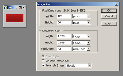
Now, we would usually resize the canvas to a valid size - probably 128x64 in this case - but since we're dealing with a very simple box button and crispness is not a real issue, we will resize the image, as I mentioned in the first "type" of solution we had. This will provide a good example of the "other" kind of export.
So call the "Image > Image Size" menu. This works like the "Canvas Size" window, but it will resize the image inside the document properly. When the window opens, turn off the "Constrain Proportions" option - we want the image to be resizeable with no respect to ratio. Also, use width and height values that are valid power of two numbers - 128 and 64, respectively.

Press OK and the image will get a bit bigger.
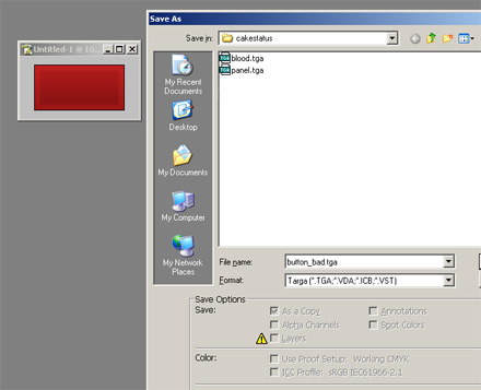
Now, to save. Since we're not using any transparency - it's a box button after all - we don't have to worry about alpha channels. So we just do the "File > Save as" or "File > Save as a copy" directly. In the window that pops up, make sure you don't have the "Alpha channels" check on (it's off if you don't have any additional channel anyway). Save it on the same "cakestatus" directory, this time with the "button_bad.tga" name. On the window that pops up, select 24 bits per pixel - again, we're not using alpha channels, so we only need RGB values.

Close this new document, don't save, and get back to the original PSD file.
Now, I don't want to sound repetitive, so I'll just be brief and say to you to do the same thing with the other buttons. Save them as "button_soso.tga" and "button_ok.tga", on the same "cakestatus" directory.
With that done, we're almost there. There are a few other layers to export: the status symbols. Like the first materials we exported, these ones also have transparency settings, so we'll need to do all the channel process again.
So get to the original PSD file, hide everything, open up the "_status" folder, and show one of the layers. Now, repeat the exporting process (notice step 7 is different)...

1. Select everything (CTRL+A)
2. Copy merged (SHIFT+CTRL+C when a visible layer is selected)
3. Create a new image document (CTRL+N)
4. Accept the default properties (ENTER)
5. Paste the flatten material (CTRL+V)
6. Delete the default "background" layer
7. Resize the canvas ("Image > Canvas Size") using an 128x128 size and at the center/middle
8. CTRL+Click on the only layer on the layers list to select its transparency
9. Use the menu "Select > Save Selection", use any name
10. Save as a copy, format TGA, with Alpha Channels, with 32 bit color
11. Close the image document, don't save
Do this for all three "_status" layers, saving them to the "cakestatus" folder. I saved them as "symbol_ok.tga", "symbol_soso.tga", and "symbol_bad.tga".
One note about step 7: I used the 128x128 size, which is the nearest bigger valid size for images that size. Also, instead of using the top left corner, I centered it; this makes it easier to position this type of windowDef in the GUI script later.. or else we would have to manually center the symbols later in relation to each other. This way, we just place them at the same position.
And now, after we have exported everything, we're *finally* ready to create the GUI itself. Close Photoshop (you don't need to save the original PSD file since we didn't modify it) and we're ready to move.
Open up the GUI editor we've setup on the previous lesson, and create a new blank GUI document. Before anything, save it as "cakestatus.gui" on the same "<doom3>/base/cakestatus" directory we created earlier and placed our materials.
Let's start from the bottom levels: create a new windowDef (menu "Item > New > windowDef"), and double-click it to edit its properties. On the "General" tab, give it the "panel" name. Move to the "Image" tab, check the "Material" option, and type "cakestatus/panel" as the material name.
Something important to remember: even though the .gui file is at the same directory as the material itself, all file access is still relative to DOOM 3's current game base directory - in this case, "<doom3>/base". So "cakestatus/panel" will refer to "<doom3>/base/cakestatus/panel.tga".
Click OK and see the result. The new windowDef is created, and sure enough it has our panel as a background. The size is wrong, though; what have to do is to manually set the windowDef size to match the original size - since the PSD was created as a 1024x512 screen, this is rather easy...

...just go to the "transformer" window and use the original image sizes as values (1024x512). Also, "center" it on screen - 20x20 in our case, simple math considering 640-600=40 (20 to each size), and 480-440=40 (20 to top/bottom).
Do it again now for our blood/broken glass overlay. Create a new windowDef, double-click to open its properties, and give it the "blood" name, and use "cakestatus/blood" as a material to it on (of course, you could set all these properties on the "Properties" window itself, if you already knew the property names). Resize it to 1024x512 and position it at 0x0, and our cake status panel is starting to take shape.

Now we will finally add text. Simply create new windowDefs, double-clicking them, adding text, setting the size accordingly, and moving them to the right position and sizes. This is kind of a boring task and must be pretty basic for you now, so I won't get into it much; here's the result though.

Nice, but something looks weird. What's it?
The thing is, our new text is showing on top of the blood overlay. It has to be below it so it can also be tainted with blood and by the brightness created by the broken glass... and look natural, of course.
Look at the "Navigator" window, showing the windowDef items; since button_bad was the last one we created, its the last on the list, on the bottom. This is because the navigator window use the same system as the GUI code itself: new items are positioned on top of the other items, so items on the topmost position are shown on the end of the list.
This is easy to fix, though. On the navigator window (or on the editing area itself), right-click on the "blood" windowDef, and on the menu that pops up, select "Arrange > Bring to Front" or simply CTRL+SHIFT+], something Adobe Illustrator users will recognize. Sure enough, after doing this, our text windowDefs are now below the blood overlay, so the text looks like it has been painted with blood.

Now we'll create the buttons. Create a new windowDef, edit it and name it "button_bad", set its material to "cakestatus/button_bad", use "BAD" as its text, and press OK. Set its size (82x37) and set its position (you can simply move it).

Two things to notice on this screenshot: first, I already moved the "blood" windowDef to the 'top' again, so remember to do this on this and on the following steps. Second, Remember we resized our button material to 128x64? We're now back at using the original size (82x37), and it looks good.
Also, we're finally using a windowDef with a background image AND a text.
Now do the same with the "button_soso" and "button_ok" materials: create a new windowDef, name them, set those images as material, set its text, and position and resize them. You may also just copy the "button_bad" windowDef and then paste it again (to duplicate), changing its name, material, and position. This is easier, of course, so I'd recommend that.
After doing this, remember to send the "blood" windowDef to the bottom of the list again, so it'll display on top of everything.
Also, just like in Photoshop, you may also wish to make the "blood" windowDef invisible (clicking on the little eye icon on the navigator window) so you can work with the other windowDefs without having to worry with the overlay getting in the way. Turning it on or off doesn't change the "visible" property of the windowDef, so this is a editing-time only feature. On the screenshot below, I've turned it off so I can see what I'm doing better.

Time to move on. Now, we'll create the status panels. Create a new windowDef, name it "status_ok", and position it roughly on the middle of the screen, as below. Position or size is not that important, since this windowDef's boundaries won't be shown, but be sure to include the area that will be used by the cake status messages (the whole middle area).

Now create other windowDef again. Name it "symbol_ok", and set its material to, sure enough, "cakestatus/symbol_ok". Set its width and height (128x128) and position it roughly at the left-hand side of the "status_ok" windowDef we created earlier.

I'll tell something in advance: we're doing this all because, in the next lesson, we will be able to turn the status windowDefs on and off, so it's better for us to have everything organized and correctly nested. We will, then, nest the "symbol_ok" windowDef inside of the "status_ok" windowDef.
To do this, either on the editing window or in the navigator window, select both "status_ok" and "symbol_ok" windowDefs. One *important thing* to remember: it doesn't take the windowDef order into account, but rather the order you selected them. The first windowDef you selected will always be the parent, and the rest, the children. So select the "status_ok" windowDef first.
Next, right-click, and select "Arrange > Make Child" in the menu that pops up.

Doing this, the symbol windowDef is into the status windowDef, and the navigator list update showing the children hidden (you have to open the parent windowDef by clicking on arrow to see the rest of the children). This is very similar to Photoshop's "Group with previous" (CTRL+G) action, and it works in the same way in the meaning that child windowDefs are now part of the parent windowDef and are masked by this parent.
Now, to create more text.
Create a new windowDef, and name it "text_ok". This will contain a description of the current status. I've used the "english" font, with scale 0.3, and the text "Cake is proper for eating. Observation is advised up to 4 hours after consumption. Adverse symptoms should be reported at once to the cake status updater team.". Also, give it a good position next to the "status_ok" picture.

Great. Now it's time to make it also a child of the "status_ok" windowDef. Select both "status_ok" and "text_ok" windowDefs, in this order, and again, do right-click and select "Arrange > Make Child". The "text_ok" windowDef will be nested into status_ok.
After this, we're almost ready to do the next step, so let's test this thing. First, select the "blood" windowDef again, move it to the bottom of the list either by using the "Arrange" menu or the keyboard shortcuts. This will be the end layout of the windowDef list...

Now, save the GUI file (save always and save often), and press CTRL+T or use the "Tools > Viewer" menu to test it on the viewer.
Is this looking good or what?
Well, we're ready to move on. What we have to do is to create the remaining status windowDefs, for the "soso" and the "bad" status. Now, do you remember - on the previous lesson - when I said that editing the code is sometimes better than doing anything on the GUI editor?
Well, this is one of those moments. While we could simply recreate and set all properties again for the remaining two windowDefs, this would be too repetitive. It's easier - even to maintain the same positions we used - to just open the GUI source code and do a little copy&paste job.
Go to the GUI editor, save the GUI script file, and close it. Now, open this same file - <doom3>/base/cakestatus/cakestatus.gui - on any text editor, notepad if you wish. Look for the "status_ok" windowDef, and sure enough, there it is.

 Staff | Join the ModWiki project


